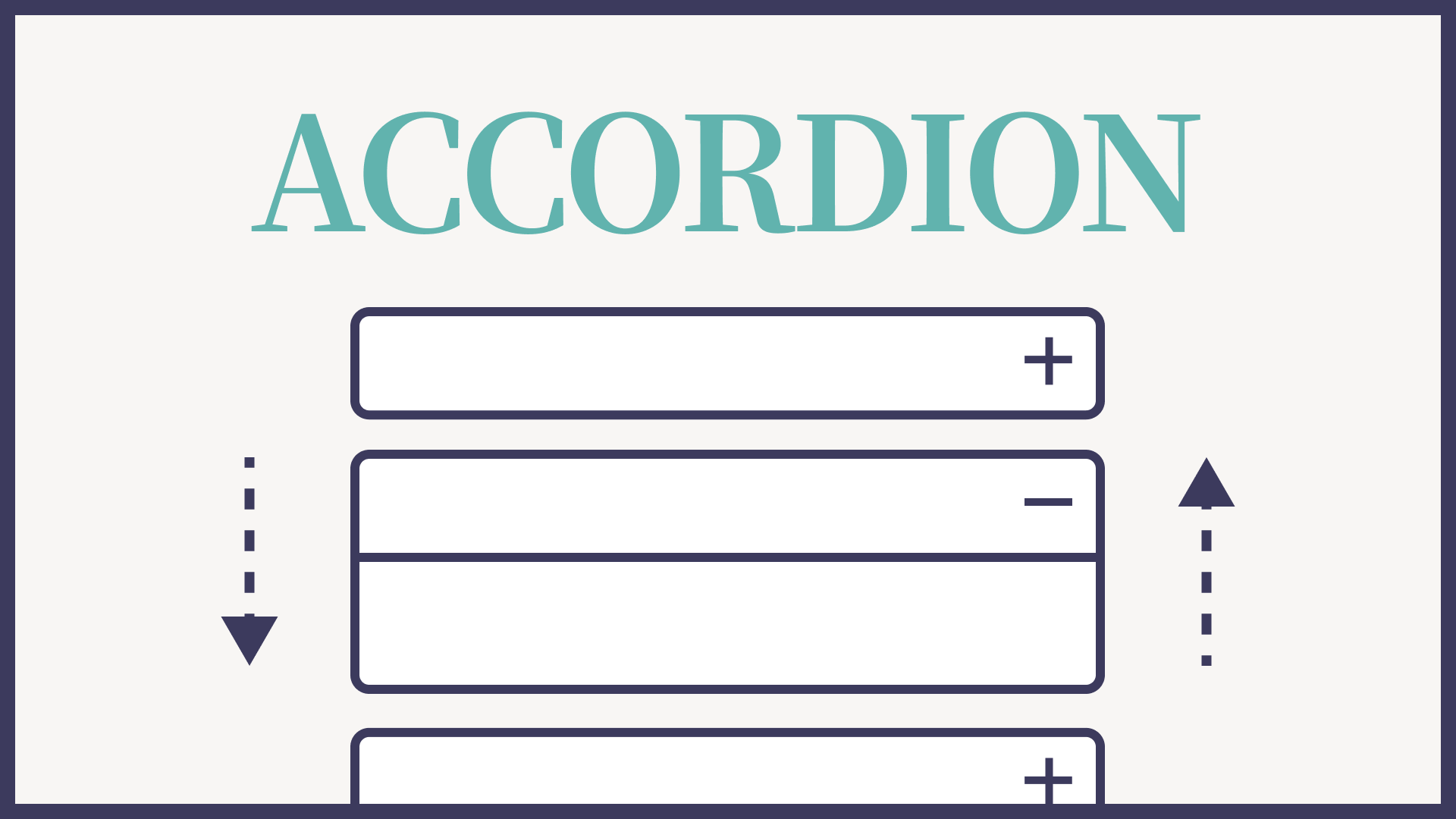
アコーディオンメニューとはコンテンツの一部が隠されていて、クリックなどのアクションで隠されていたコンテンツが表示される開閉タイプのメニューです。
当サイトでもよくある質問ページで利用しています。
今回はこのアコーディオンメニューをコピペで実装するサンプルコードを書いていきたいと思いますので是非お使いください。
デモ
まずはデモで動作をご確認ください。
- DEMO
- 隠れたコンテンツ出現
- DEMO2
- 隠れたコンテンツ出現
今回は当サイトで使用しているアコーディオンメニュー(Q&A形式)をそのままご紹介します。
サンプルコード
ではサンプルコードをご紹介します。
HTML
<dl class="accordion js-accordion">
  <div class="accordion__item js-accordion-trigger"> <dt class="accordion__title"><span></span>DEMO</dt>
    <dd class="accordion__content">隠れたコンテンツ出現</dd>
  </div>
  <div class="accordion__item js-accordion-trigger"> <dt class="accordion__title"><span></span>DEMO2</dt>
    <dd class="accordion__content">隠れたコンテンツ出現</dd>
  </div>
</dl>
CSS
.accordion {
    width: 100%;
    display: grid;
    gap: 24px;
    font-size: 1.8rem;
}
.accordion__item {
    border: 1px solid #eee;
    cursor: pointer;
    border-radius: 3px;
}
.accordion__title {
    position: relative;
    padding: 15px 60px 15px 20px;
    font-weight: 500;
    cursor: pointer;
    display: flex;
}
.accordion__title::before, .accordion__title::after {
    content: "";
    position: absolute;
    right: 20px;
    top: 0;
    bottom: 0;
    margin: auto 0;
    background-color: #333;
    width: 16px;
    height: 1px;
    transition: all 0.3s;
}
.accordion__title span::before {
    content: "Q";
    display: -webkit-box;
    display: -ms-flexbox;
    display: flex;
    -webkit-box-align: center;
    -ms-flex-align: center;
    align-items: center;
    -webkit-box-pack: center;
    -ms-flex-pack: center;
    justify-content: center;
    -ms-flex-negative: 0;
    flex-shrink: 0;
    -webkit-transform: translateY(3px);
    transform: translateY(3px);
    background-color: #6e47ff;
    border-radius: 50%;
    width: 23px;
    height: 23px;
    color: #fff;
    font-family: "Roboto", sans-serif;
    font-weight: 700;
    font-size: 1.4rem;
    margin-right: 12px;
}
.accordion__content {
    padding: 0 20px 15px 20px;
    display: none;
    cursor: pointer;
}
.accordion__content.is-open {
    display: block;
}
Javascript
// アコーディオン
const accordions = document.querySelectorAll(".js-accordion");
const accordionsArr = Array.prototype.slice.call(accordions);

accordionsArr.forEach((accordion) => {
  const accordionTriggers = accordion.querySelectorAll(".js-accordion-trigger");
  const accordionTriggersArr = Array.prototype.slice.call(accordionTriggers);

  accordionTriggersArr.forEach((trigger) => {
    trigger.addEventListener("click", () => {
      trigger.classList.toggle("is-active");
      const content = trigger.querySelector(".accordion__content");
      slideToggle(content);
    });
  });
});
あとはCSSを実装したいWEBサイトのデザインに合わせて調節してください。
まとめ
いかがでしたでしょうか。
アコーディオンメニューのサンプルコードを紹介している記事はたくさんありますが、意外とスマートでシンプルなものが少なかったので、今回記事にしてみました。
皆さまの参考になれば、と思います。